
Introduction
SwiftUI contains various tools to align views relative to each other. In this lesson, we discuss three solutions: frames, overlays and the containers(VStack, HStack and ZStack). A separate section is devoted to the slightly more complex method AlignmentGuide().
Frames
The .frame(width:height:alignment:) modifier is a simple solution if you want to position a single view element at a specific location.
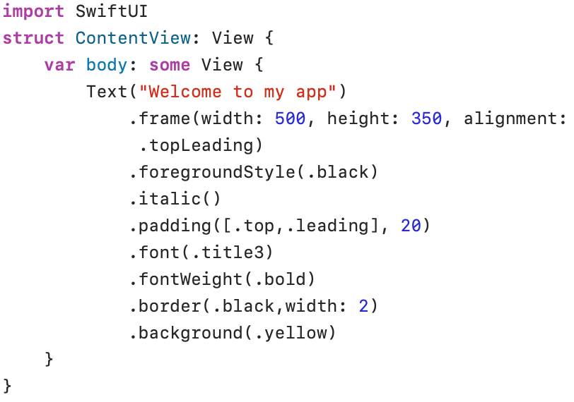
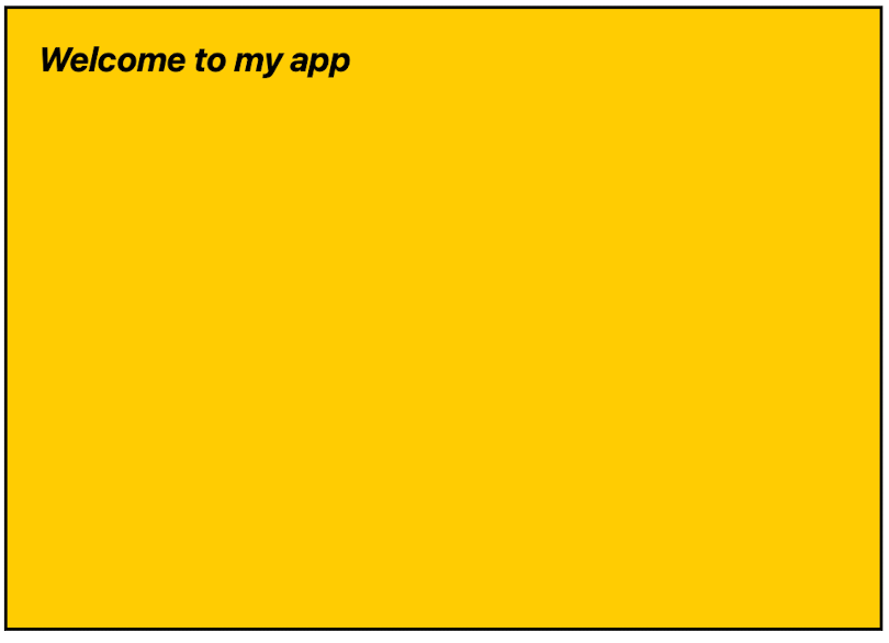
The modifier .frame(width: 500, height: 350, alignment: .topLeading) defines a fixed frame with a width of 500, a height of 350, and text alignment to the top left (.topLeading). The style modifier .italic() has been used to put the text in a slanted font style. The .padding([.top, .leading], 20) modifier adds empty space to the top (.top) and left (.leading) edges of the frame. The individual edges (.top, .leading, .bottom, .trailing) are placed between square brackets.
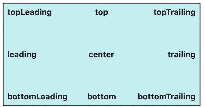
The available alignment codes are displayed in the following image:
Overlay
With the modifier .overlay(alignment:content:), you can place a new view on top of an existing view. The .overlay() method has an alignment parameter to position the new view on the existing view.
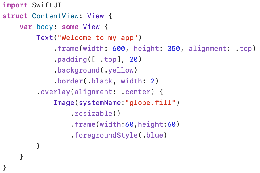
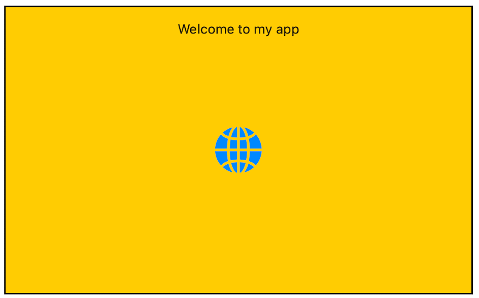
In the example above, we center (alignment: .center) the Image named “globe.fill” on top of the existing view. The content of the new view is defined in a trailing closure (between braces {}). The .resizable() modifier is required to adjust the size of the image.
Containers
In this section, we discuss three ways in SwiftUI to arrange subviews in a view: VStack, HStack and ZStack.
VStack
A VStack arranges all subviews in a vertical line.
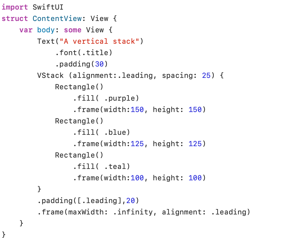
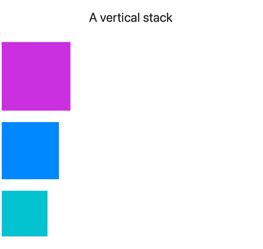
The Text view “A vertical stack” is outside the VStack. The VStack contains three rectangles, each with a different size and color.
VStack (alignment: .leading, spacing: 25) ensures that all subviews (rectangles) of the VStack are aligned on their left (.leading) edge (alignment: .leading) and that a gap of 25 dots (spacing: 25) is maintained between the rectangles.
VStack(alignment:) uses horizontal alignment guides: .leading, .center and .trailing.
After the closing brace of the VStack, .padding([.leading], 20) reserves some empty space on the left edge of the screen. The next line: .frame(maxWidth: .infinity, alignment: .leading) creates a frame that occupies the entire available horizontal space (maxWidth: .infinity) and encloses the three rectangles. This frame is not visible because no border or color has been added. The alignment parameter (alignment: .leading) moves the three rectangles to the left side (.leadingedge) of this frame.
HStack
A HStack arranges all subviews in a horizontal line.
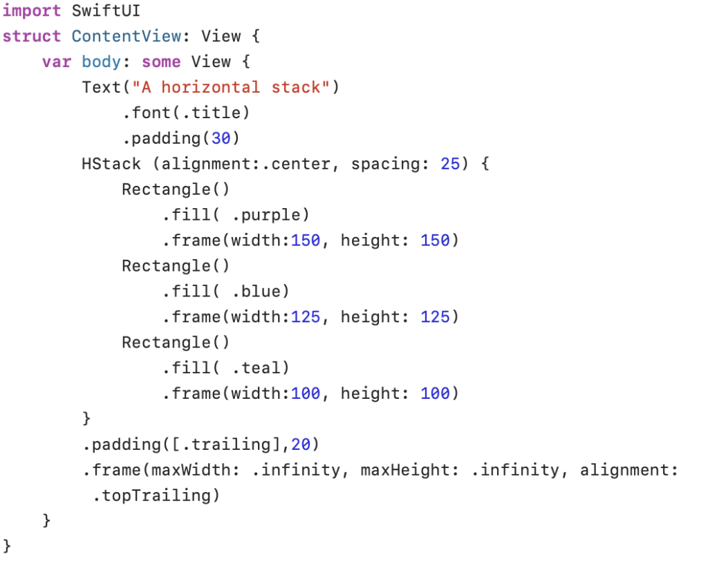
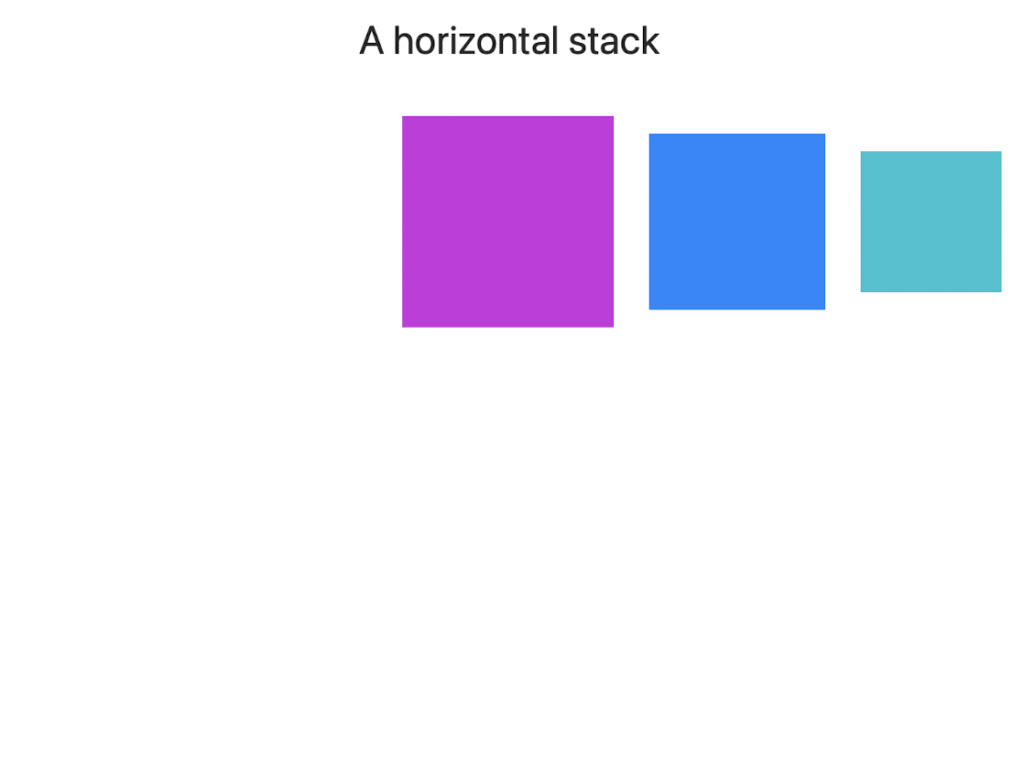
HStack (alignment: .center, spacing: 25) aligns the subviews vertically on their central axis. The line .frame(maxWidth: .infinity, maxHeight: .infinity, alignment: .topTrailing) creates a frame that covers all available space and places all subviews at the top right (.topTrailing) of this hidden frame.
HStack(alignment:) uses vertical alignment guides: .top, .center, .bottom, .firstTextBaseline and .lastTextBaseline. .firstTextBaseline and .lastTextBaseline can be useful if text of different sizes needs to be aligned or if text needs to be aligned with images. .firstTextBaseline uses the baseline of the first Text view in the Stack, .lastTextBaseline uses the baseline of the last Text view in the Stack.
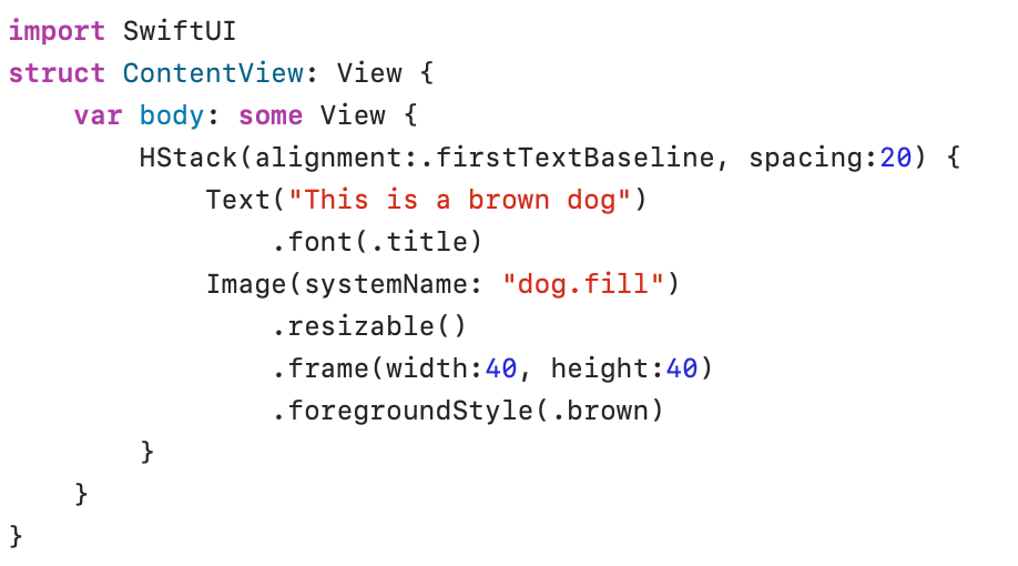
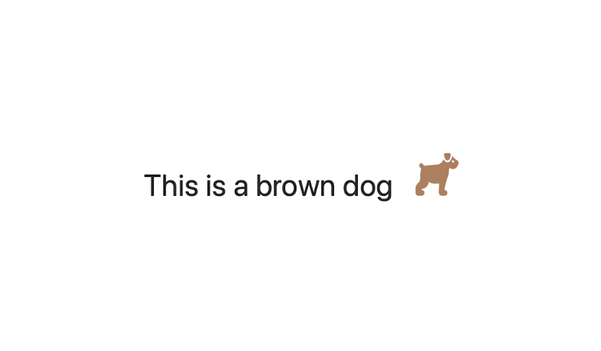
In the example above, the baseline of the Text(“This is a brown dog”) is used to align the text and the image.
ZStack
The child views in a ZStack are layered on top of each other. The first view is placed in the back, all other views are stacked on top of each other.
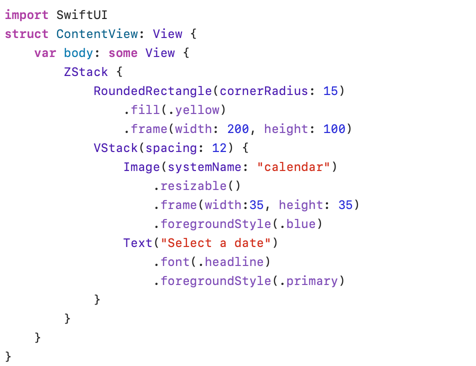

RoundedRectangle(cornerRadius: 15) is the first view in ZStack. The attribute cornerRadius specifies the roundness of the corners. The RoundedRectangle() view is placed in the back. Image(systemName: “calendar”) and Text(“Select a date”) are the child views stacked on top of the RoundedRectangle() view. .zIndex(_:) can be used to change the order of the stack elements. Views with a higher .zIndex(_:) value (for example .zIndex(2)) appear above views with a lower value (for example .zIndex(1)) in the ZStack. The default .zIndex value is zero.
.foregroundStyle(.primary) uses the system’s main color. The .primary color attribute is context-aware: it will be black in light system mode and white in dark system mode. Other semantic colors available in SwiftUI are: .accentColor and .secondary.
AlignmentGuide
The method alignmentGuide(_:computeValue:) can be used to calculate an offset to change the relative position of views in a stack. The following examples can help to understand how to use this method:
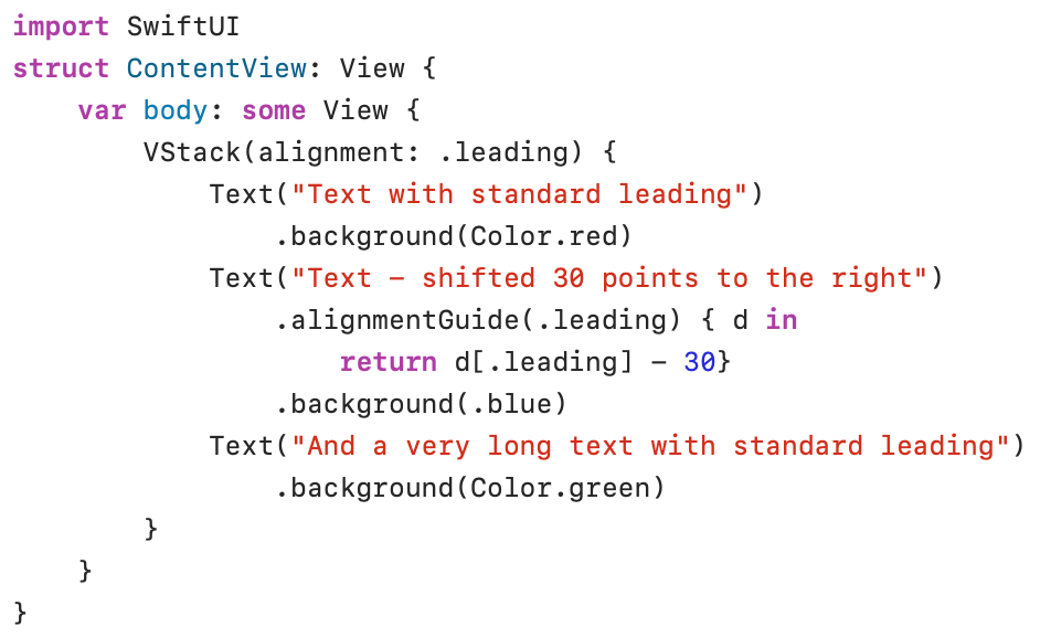
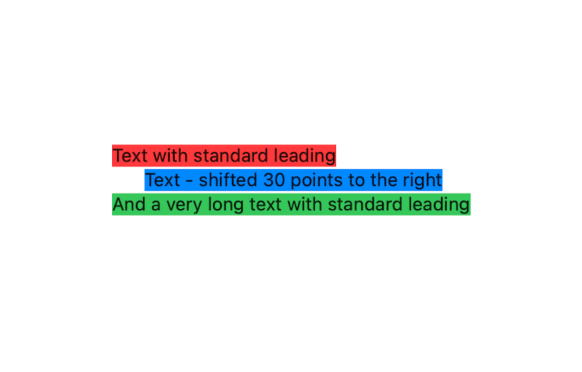
The VStack above contains three simple Text views. In a default situation (without the .alignmentGuide modifier in the second view) the VStack .leading modifier will align the left edges of the three Text views. You can check this by placing the .alignmentGuide modifier in a comment line.
Let’s try to explain the line .alignmentGuide(.leading) {d in return d[.leading] – 30}. The first parameter (.leading) refers to the edge of the view we want to redefine. The calculation of the change takes place in the trailing closure (between curly braces). The return value of the trailing closure is d[.leading] – 30. In reality, we are lying here by claiming that the leading edge of the second view has shifted 30 points to the left (-30). This would mean that the image has become 30 points larger. If VStack(alignment: .leading) now aligns with the false leading edge, we get an indentation to the right relative to the other views (the leading edges of the other views are still correct).
In the following example, I have written out the full closure. Here, dimensions refers to the SwiftUI structure ViewDimensions. ViewDimensions not only keeps track of the height and width of a view but also provides information about the .leading, .center, and .trailing positions of the view. The type of the return value is CGFloat (a floating point type).
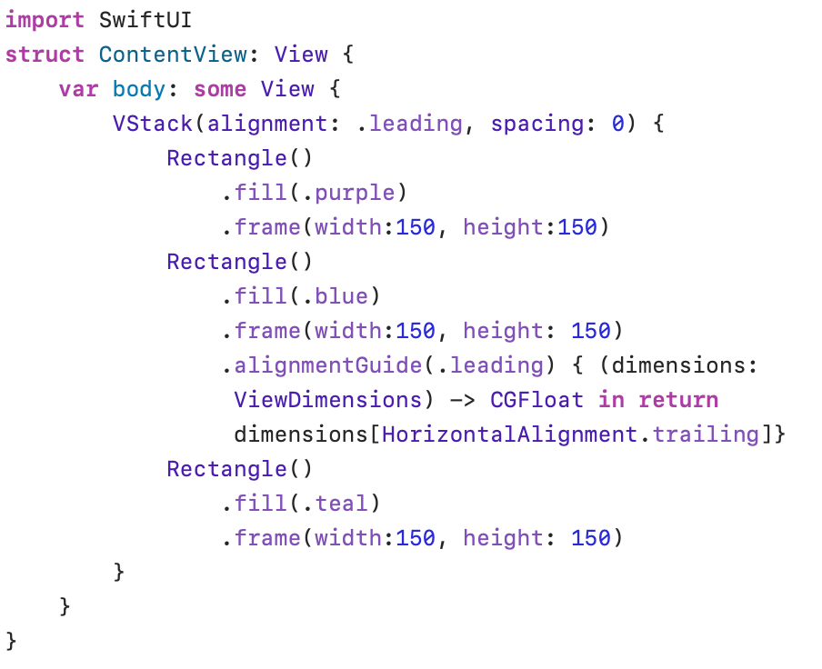

The requested return value available in the variable dimensions is the value of the trailing edge (HorizontalAlignment.trailing). This means that the leading edge is incorrectly shifted further to the right, making the image appear larger. The VStack .leading alignment modifier then shifts the entire rectangle to the left.