
Introduction
In this lesson, we discuss several important components that can further complement your program. Buttons are often used to start an action, toggles are useful for supporting yes/no choices, and drop-down lists (pickers) allow you to choose from a range of possible values.
Button
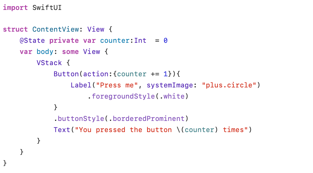
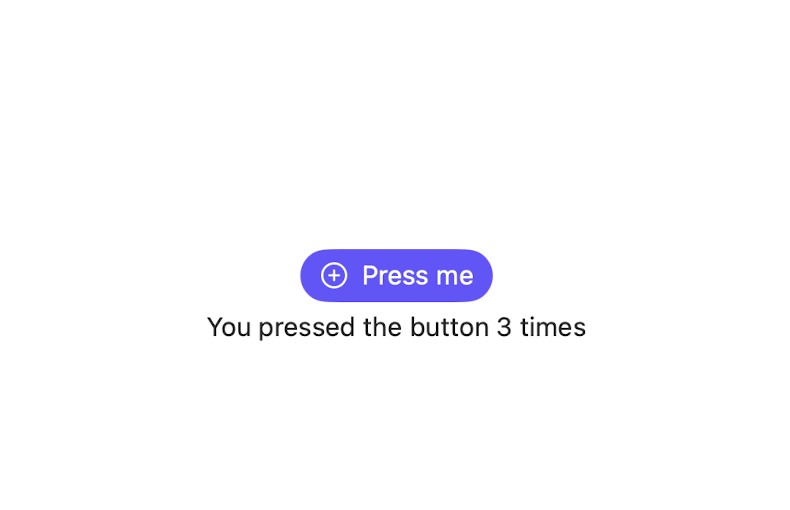
A Button contains a label that describes which action is performed when the button is pressed. In the example above, the button contains the text Press me with an accompanying icon (plus.circle). The text and the icon are combined in a Label view. A shorter (but, in my opinion, less clear) notation to define this button is: Button (“Press Me”, systemImage: “plus.circle”, action: {counter += 1}) . The .buttonStyle(_:) modifier .borderedProminent is used to define a button with a high-contrast background.
When creating a button, you can even assign a role (for example: Button(“Delete”, role: .destructive, action:{deleteRecord()}) ). SwiftUI adjusts then the style of the button based on the role (for example: a red foreground color for a .destructive role).
Toggle
A Toggle is a control that allows you to choose between two binary states (true/false).
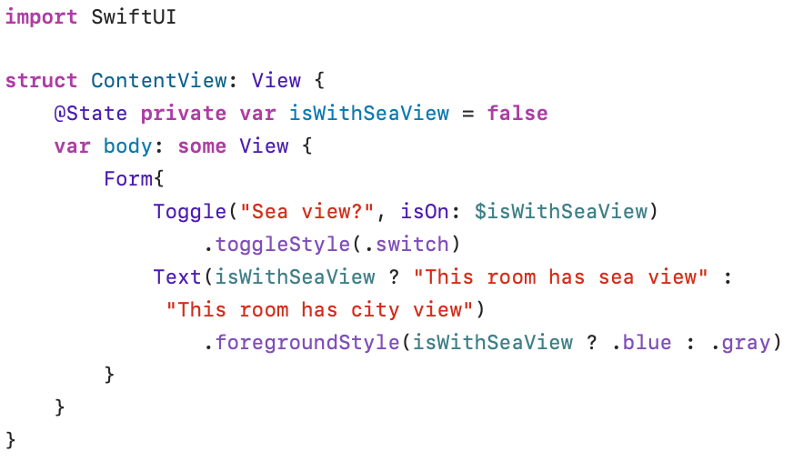
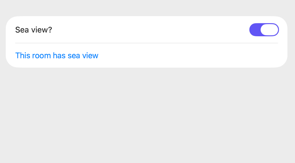
The variable @State isWithSeaview can have two states (true and false). With the switch(.toggleStyle(.switch), you can toggle the on and off positions. If the variable isWithSeaView is true, the text This room has sea view is displayed in blue; if the variable is false, the text This room has city view is displayed in grey. The .toggleStyle modifier accepts the values .automatic, .button and .switch. Only macOS supports the .checkbox style.
Picker
Selection list defined in Picker
A Picker is a control that allows you to select one value from a list of values.
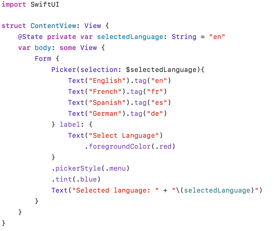
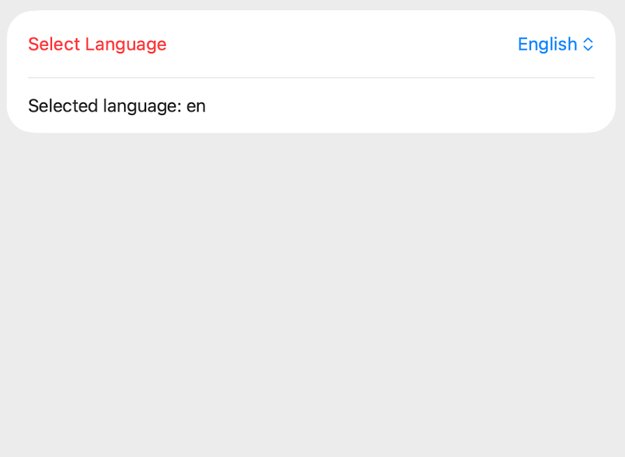
A Picker has a label that describes the kind of value you can select. The content of the picker is a list of values from which to choose. The .tag() modifier contains the value that is assigned to the @State variable (selectedLanguage): if you select French from the list, the value of selectedLanguage will be fr.
The .pickerStyle modifier can have the values .menu, .segmented, .wheel and .inline. Experiment a bit to see which modifier suits your application best.
Selection list generated from enum
In most cases, the selection values are made available via an enum or originate from a table in the database. In the following example, we start with an enum list to define the content of the Picker.
To make the list Identifiable, the language code is defined as an id: Self(self). The language code must therefore be unique. CaseIterable automatically generates an array called allCases with all values defined in the enumerator. Each element in the enum has a rawValue with the full name of the language.
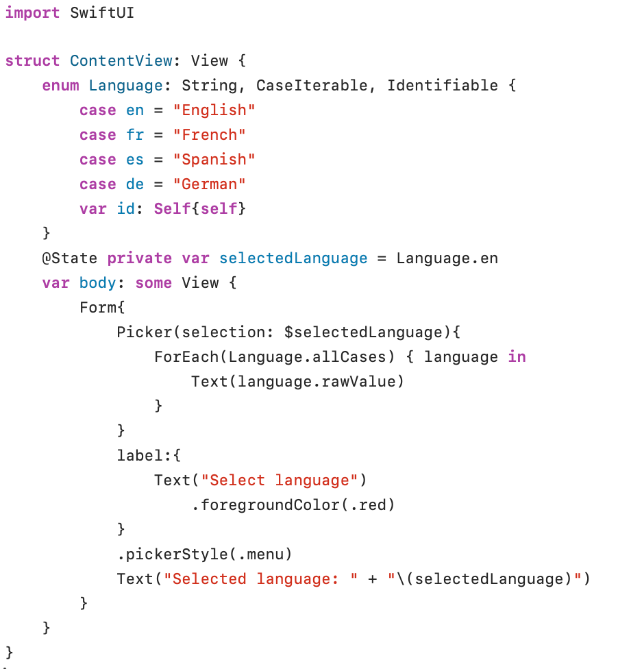
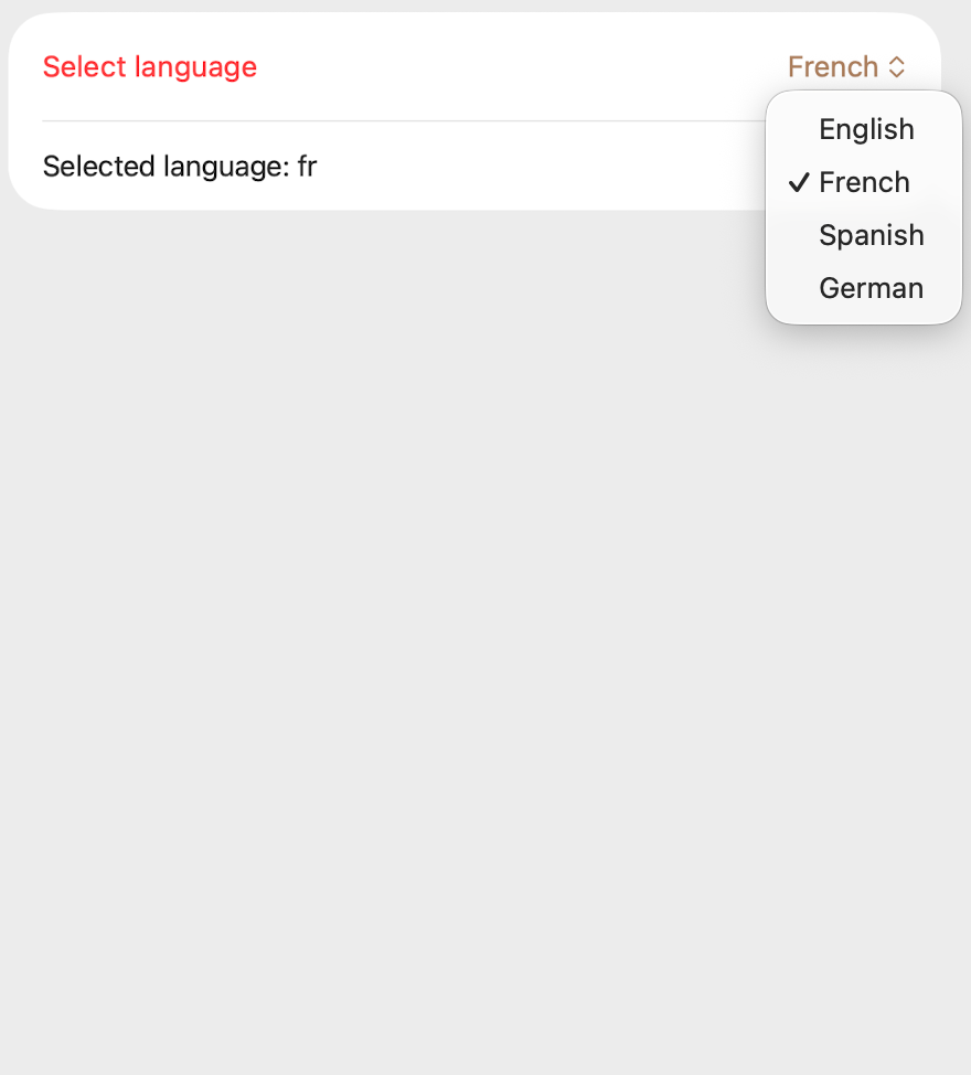
The ForEach statement uses the array allCases, generated from the Language enum, to display the rawValue of each element in the array.