
Introduction
SwiftUI uses a TextField view to collect data from an input field. In this lesson, we also learn how to use a TextField to enter various data types (String, Int, Currency, Date). At the end of the TextField section we introduce the important modifiers onChange() and onSubmit().
In the second part of this lesson we introduce the Form container to organize interactive controls on the screen.
TextField
String data
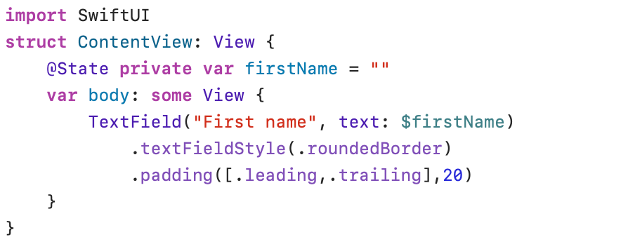

The label “First Name” in the TextField control serves as a placeholder before you can enter data. The hint disappears as soon as you start entering data.
The text parameter in the TextField control is followed by a variable included in an @State property. This variable ($firstName) must be preceded by a $ sign to indicate a two-way binding to the @State property (firstName). An @State property must be declared private(the property is only accessible in this structure).
In a normal Swift struct, you cannot simply modify properties from the body. @State bypasses this limitation by transferring variable management to SwiftUI itself, outside of the struct. When the value of an @State variable changes, SwiftUI automatically redraws the View to display the new data directly on the screen.
The modifier .TextFieldStyle can be used to specify the appearance of the TextField.
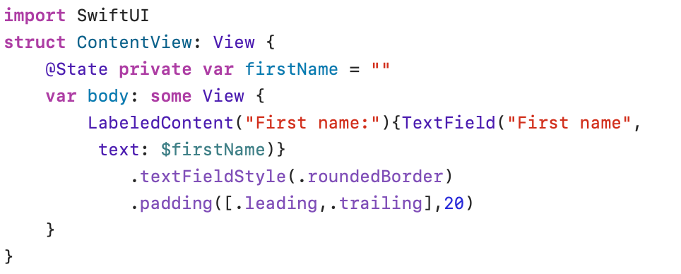
To add a label before the TextField the LabeledContent() structure can be used. The TextField then forms part of the trailing closure.

Int data
The program for entering Int data is virtually identical to the previous program:
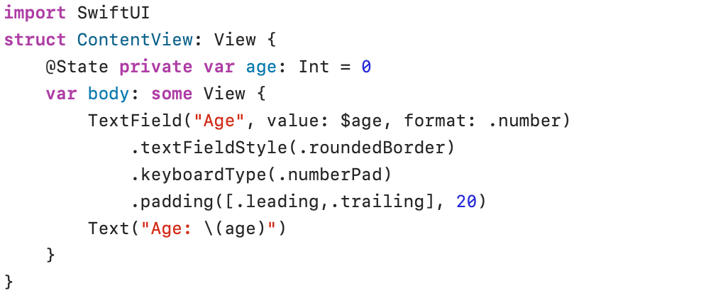

It is important to note that the text parameter, which applied to String input, has been replaced by the value parameter. Furthermore, the parameter format(.number) ensures that the input is automatically converted to a number compatible with the declaration (Int) in the @State property.
The modifier .keyboardType() determines which keyboard should be displayed when using the program on, for example, an iPhone.
Currency data
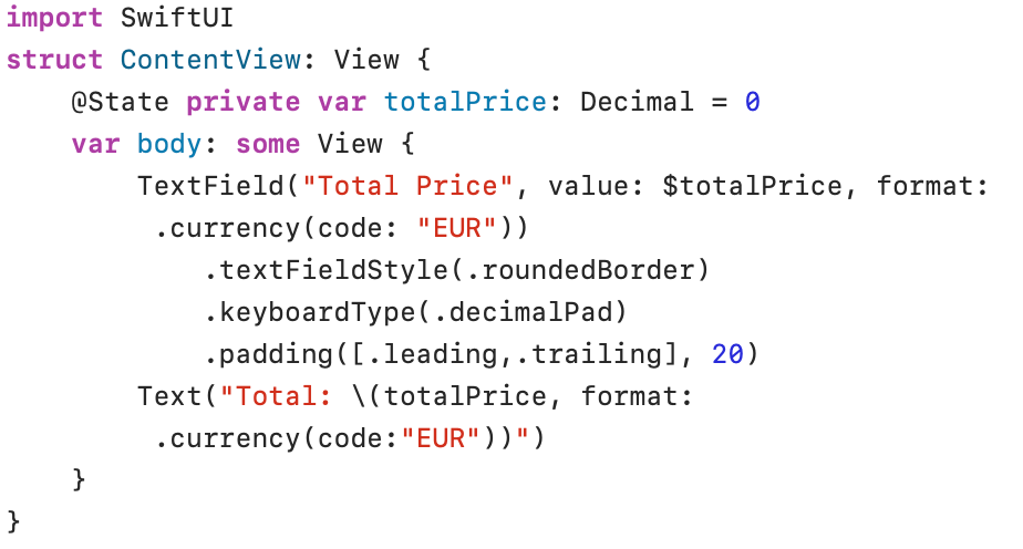

Note that the variable totalPrice is declared of type Decimal. The Decimal type is recommended for financial data. This is because the Float and Double types sometimes cause problems with decimal amounts.
The format: .currency(code: “EUR”)) indicates that the currency code EUR must be used. The € sign is automatically added to the TextField and the displayed data (€ 123.456,78) in the Text view uses the number format defined in the settings of the computer system.
Dates
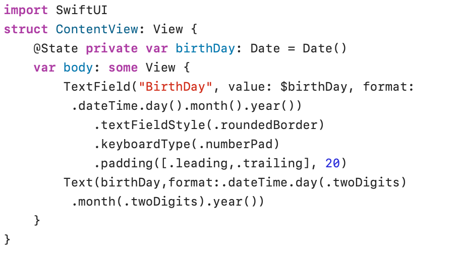

The data type of property variable birthDay is Date and is initialized with the actual Date (Date()). In the dateTime format the developer can specify how the date must be displayed.
onChange() modifier
The onChange(of: initial:_:) modifier fires an action when a value changes. In the following printout, the onChange() modifier was used to check whether a specific input field (fullName) is filled in. An empty input field is indicated by a red border around the TextField. A filled field changes the border to gray.
To better illustrate the operation of the program, a new border has been defined around the input field using the overlay() modifier. The variable borderColor in the @State property keeps track of the current color.
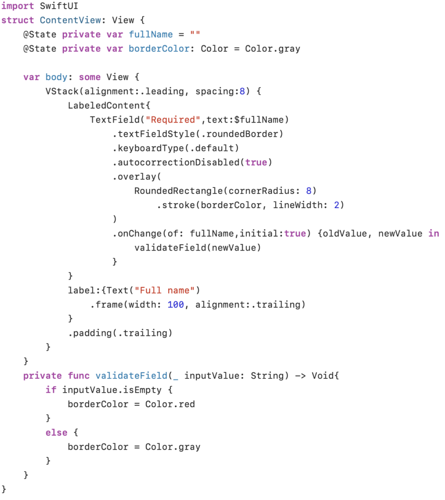
In the onChange() modifier, the parameter of is followed by the variable (fullName) to be checked. The initial (true) parameter is used to check the value when the view initially appears. The red border indicates that the input field is empty:

The validateField() function is used to check the input field and adjust the border color (borderColor) based on the content of the field (empty = red, content = gray).

onSubmit() modifier
The onSubmit(of:_:) modifier executes a piece of code when the return key is pressed in a TextField. The onSubmit() modifier is very useful for moving the focus to another TextField after you have pressed the return key.
The following program uses two TextFields. The TextField for the firstName is given focus at the beginning of the program. After the first name is confirmed by pressing the enter key, onSubmit() ensures that the focus is moved to the TextField for entering the lastName.
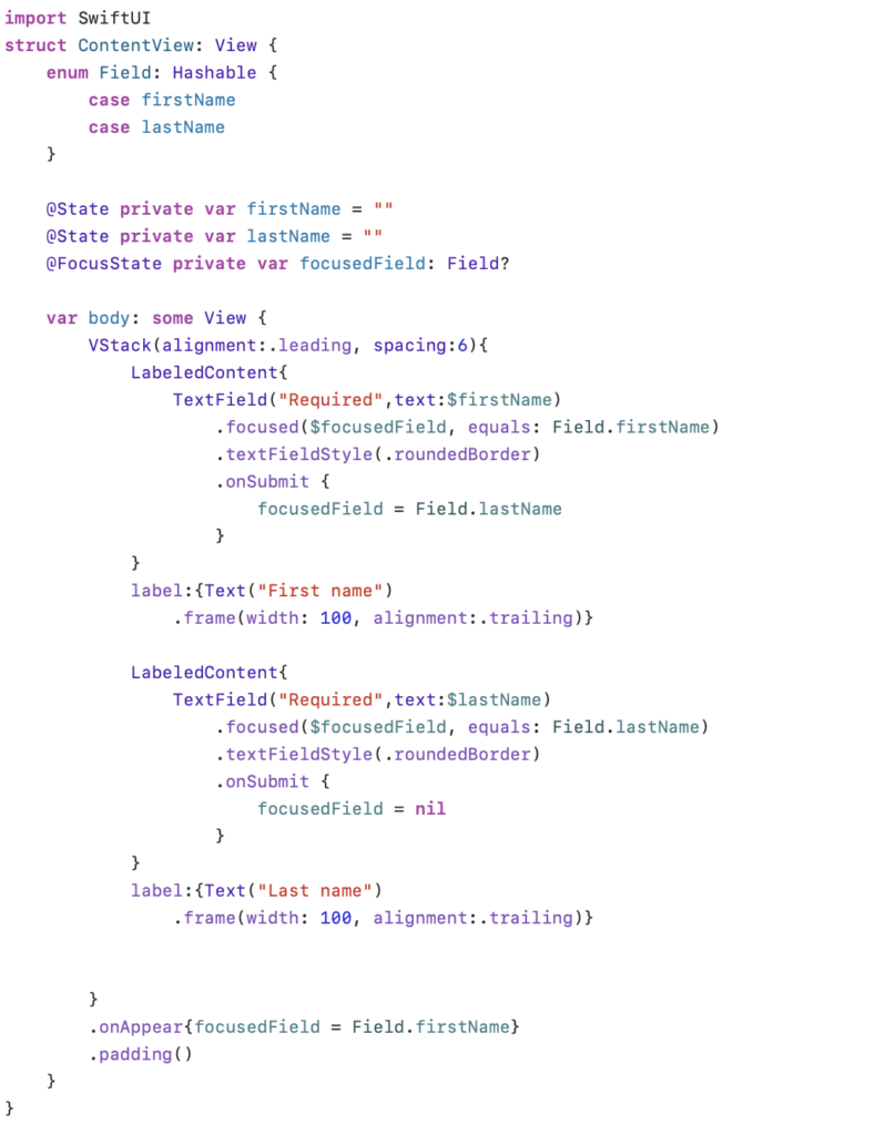
The property wrapper @FocusState holds the field that has the focus in the variable focusField. The focused(_:equals:) modifier binds a value (Field.firstName, Field.lastName) defined in the enumeration named Field with the @FocusState variable focusField.
The enum Field is declared to conform to the Hashable protocol. This means that each case can be converted into a uniqueinteger value.
The variable focusField is modified by the onSubmit() modifier. The Enter key confirms the input of the first name and moves the focus to the next TextField (focusField = Field.lastName). A nil value removes the focus from all bound fields (focusField = nil). Because focusField can be nil , the variable focusField must be declared as optional.
The onAppear() method defined at the end of VStack is used to define the focus (focusField = Field.firstName) before the VStack is displayed.

Form
A Form is a container to organize and group controls, such as text fields, buttons, pickers… in a standardized, scrollable layout. The displayed layout is platform-dependent.
A Form groups the controls into Sections, with an optional header and footer.
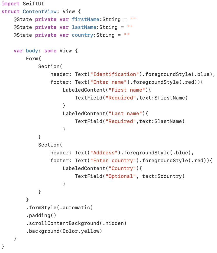
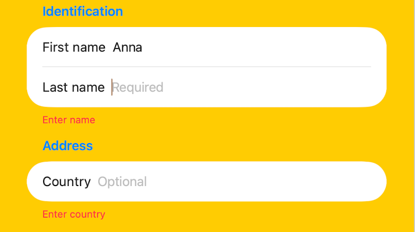
The Form above is divided into two Sections, each with a header and a footer. The default value for the formStyle modifier is automatic.
The .scrollContentBackground(.hidden) modifier was used to remove the default gray background of the Form container.